
Your brand’s narrative isn’t confined to your captions; it’s embedded in every pixel of your images. Before anyone ever reads your words, they sense your mood through tone and color. Warm colors evoke warmth and intimacy, cool colors convey sleek futurism, and bold contrast smacks of excitement. With a bit of tweaking, your photos become less about random uploads and more about brand statements.
That’s where Pippit comes in. Whether you’re editing stills or creating short-form content, it has all the tools you need to coordinate your visuals with your brand voice. If you’ve used its AI clip maker to create your scroll-stopping videos, then you’ll understand how seamlessly its photo tools fit into your creative process.

Why tones matter more than filters
A filter is a shortcut. Tone, however, is a decision. By deliberately altering tones, you’re not only “correcting” a photo; you’re affirming the character of your brand. A warm gold imparts a feeling of, “You’re welcome here.” A steel blue color scheme communicates, “We’re sharp and reliable.” High contrast yells, “Hey, look at us, now. Tone is the invisible soundtrack behind your imagery. It primes the audience before they even read a single word.
Cozy warmth that feels human and personal
Imagine warm oranges, gentle highlights, and benevolent shadows. Skin tones appear healthy, wood finishes radiate, and food images taste delicious. Warm edits are appropriate for cafés, lifestyle goods, wellness companies, or any company founded in community and proximity.
Cool color palettes that exude sophistication
Sharp whites, tempered grays, and soothing blues connote precision and smartness. They are perfect for tech startups, finance firms, contemporary interiors, or wellness products. Cool colors imply control and refinement without appearing chilly when done with restraint.
High contrast that demands attention
Dark blacks, bright whites, and jagged edges produce a sense of urgency. They’re high-energy, young, and can’t be scrolled by. This aesthetic works seamlessly with sporting brands, street fashion, or adverts that desire to be confident and unapologetic.
Creating a tone triangle
Three dials can dictate each edit:
- Temperature: warm vs. cool
- Contrast: soft vs. sharp
- Saturation: muted vs. vibrant
By balancing these three, you can build a repeatable visual language which makes your images consistent but not repetitive.
Small business advantage: Polish without the studio
Big companies get to hire entire production teams. Small businesses and manufacturers usually have to make do with rapid grabs. This is why tone edits are such a great leveler. An ordinary photo, tweaked nicely, can suddenly appear as part of a pro campaign.
Need to tweak resolution or grain out before grading? A free image enhancer online can get your base image ready in no time, so your edits hit cleanly. It’s a free way to add more bites to your visuals.
Texture as mood
Other than color, micro details count. A warm brand could mute sharpness to maintain a gentle feel. A technology-based brand could emphasize definition so that all edges are sharp. An energetic label could add texture carefully to the area of movement, sneakers, or billboards. These small things are what make an image look considered rather than over-processed.
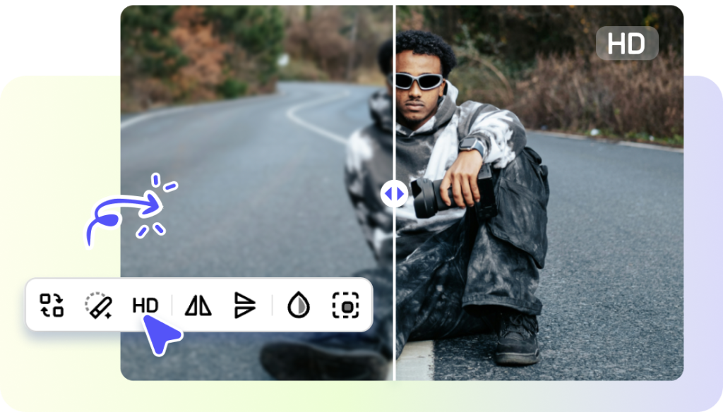
How to glow up your photos with Pippit
The most wonderful thing about Pippit is that it maintains tone editing accessible while remaining professional. Here’s how to create brand-consistent images in three simple steps:
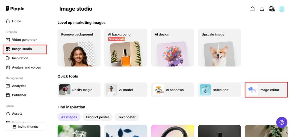
Step 1: Upload your images
Make a Pippit account, then launch Image Studio from the left-hand menu. Select Upscale Image to increase resolution, or Image Editor for more advanced changes. Upload directly from your device and choose Image Upscaler from Smart Tools to reveal concealed detail in your photo.
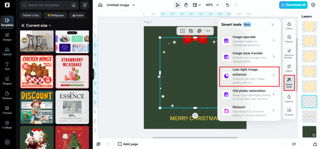
Step 2: Upscale and edit your images
Now finish your images. Use Retouch to soften faces, add Effects for a deeper color narrative, or light up dark photos with Low-Light Image Enhancer. Insert overlays, stickers, or text where you need them, and fine-tune textures to your brand’s personality.
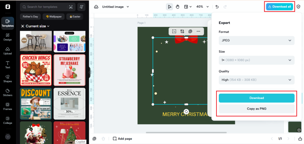
Step 3: Export your images
When you’re happy with everything, click Download All in the right-hand corner. Choose your file type and size, then download your edited images to use for posts, ads, or even your next complete campaign.
Photos and videos need to speak the same language
Your stills and videos must have the feel of belonging to one conversation. Like grading photographs, your clips benefit from thoughtful trimming and tonal correction. Pippit’s online video cutter simplifies the process of removing filler and maintaining energy compact, and your color edits maintain the mood throughout each frame. This ensures easy continuity across devices.
When rules can bend
A solid brand aesthetic doesn’t have to equal rigidity. A holiday campaign or new product launch is an excellent time to push your palette. Perhaps you introduce saturation during summer, or mute tones for a holiday release. The intention is to create the exception by design, then refocus on your baseline, so your audience is never left behind on the thread of your identity.
Wrapping it up
Color tone and grading are more than touches, they’re the foundation for your brand’s attitude. Warmth beckons, cool tone cuts, and contrast wakes up. You don’t require a studio or multiple software subscriptions to get your visuals on the same page as your brand with Pippit. From photos to video, everything can reside under one creative umbrella.
Ready to give your photos the feel that makes them really yours? Begin with Pippit now and turn everyday shots into tone-tied assets that work as hard as your words do.


